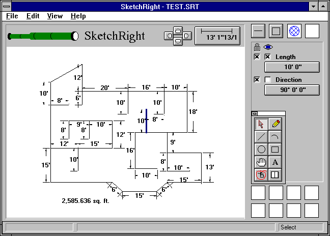
SketchRight is a product of our company, Saltire Software. It is designed to allow people like architects to sketch out a building and use a laser to enter dimensions. SketchRight automatically solves the geometry to produce an accurately scaled drawing. SketchRight can also be used by utility workers to sketch out intersections including gas mains, telephone poles, etc.
I did the user-interface design on SketchRight. This page talks briefly about some of the design issues which went into SketchRight.

Three important principles in good user interface design are consistency, simplicity, and discoverability.
Consistency comes out more through interaction rather than through a screen shot, so it is not discussed futher.
SketchRight has a very simple interface. All of the major functionality is visible on the main screen, which limits the complexity in the app. The design is uncluttered--the program doesn't have thirty toolbars littering the screen. There are two major work areas. The white space is the drawing area and the gray area at the right controls the dimensioning functions.
SketchRight has a discoverable interface. The major functions are visible on the screen, so the user has an idea of what is available. Important functions are not buried twelve levels deep in menus, nor are they only available by hitting various combinations of keys. SketchRight supports a hands-on, exploratory mode of operation.